

Turn Browsers into Buyers: The Definitive Guide to eCommerce CRO
Optimize, Analyze, and Grow: The Complete Guide to eCommerce CRO

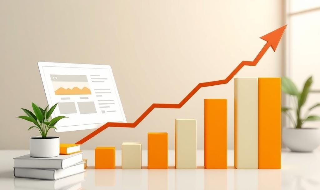
Did you know that the average eCommerce conversion rate hovers around 2-3%? That means a staggering 97 out of 100 visitors leave your store without buying. Are you pouring money into advertising, only to see most of those visitors disappear without a purchase? Frustrated with high cart abandonment and low sales figures? You're not alone.
Welcome to the world of conversion rate optimization (CRO) – the science and art of turning more of your website visitors into paying customers. This comprehensive guide will equip you with proven strategies and actionable insights to transform your eCommerce business, regardless of whether you're just starting out or looking to refine your existing approach. We'll show you how to identify the leaks in your sales funnel, understand your customer's journey, and implement changes that boost your bottom line. Let's turn those browsers into buyers!
Defining Your Conversion Goals
Before you can start optimizing, you need to know what you're optimizing for. While a completed purchase is the ultimate goal for most eCommerce stores, there are other valuable actions, called "micro-conversions," that pave the way to that final purchase. Think of it like this: A customer rarely lands on your site and buys immediately. They browse, they compare, they consider. Micro-conversions are the breadcrumbs that lead them to the final purchase.
So, what might those be? The final conversion goal is usually a completed purchase or checkout . But the stepping stones (Micro-Conversions) are just as important, and you should prioritize them strategically:
Adding a Product to Cart (huge indicator of interest!)
Initiating Checkout (they've started the purchase process!)
Adding an Item to a Wishlist (they're thinking about it!)
Signing Up for Your Email Newsletter (hello, future marketing opportunities!)
Downloading a Guide (they're engaging with your brand)
Visiting a "Thank You" Page (after filling out a contact form, for example)
Starting a Free Trial
Start by focusing on the micro-conversions closest to the final purchase, like "Add to Cart" and "Initiate Checkout." These actions represent the highest level of purchase intent and optimizing them first will often yield the biggest impact.
Before you change a thing, figure out your current conversion rate. That's your baseline! And don't just set it and forget it! Monitor your conversion rates daily or weekly. Are you seeing trends? Spikes? Dips? This data is gold!
Data Analytics: Identifying Funnel Leaks
Okay, you're tracking conversions – awesome! Now, the real fun begins: digging into the data to understand why your conversion rate isn't as high as you'd like. Where are potential customers getting stuck?
Start by visualizing the customer journey
See where the biggest percentage of users are leaving the process. Are they bouncing off product pages? Abandoning their carts?
For example, if lots of people add items to their cart but don't check out, you might have issues with unexpected shipping costs, a confusing or lengthy checkout process, or a lack of trust signals.
Unlock Traffic Source Secrets: Break down your conversion rate for each traffic source. Are your Facebook ads rocking it, but your organic search traffic is lagging? Focus on the winners and double down on what's working! Investigate the underperformers: Are you targeting the wrong audience? Is your ad messaging misleading?
Mobile Matters: Is your conversion rate significantly lower on mobile? This almost always points to a poor mobile experience. And it's critical to address this, as mobile often accounts for a majority of eCommerce traffic.
Segment for Success: Segment your data! Compare the performance of different customer segments (e.g., new vs. returning visitors, demographics, geographic locations) to see which ones convert best.
Landing Page Insights: Analyze your landing pages! A high bounce rate means something's wrong. Is the page irrelevant or confusing? Also, look at metrics like time on page and scroll depth to understand user engagement.
Streamline Your Analytics with Aixel: Instead of juggling multiple analytics tools, consider using Aixel. Aixel is designed to provide a comprehensive view of your store's performance, offering AI-driven insights to pinpoint areas for improvement and boost your conversions. It simplifies the process of understanding user behavior, identifying bottlenecks, and making data-backed decisions.
Want to know other metrics you should be tracking everyday? Checkout this Article

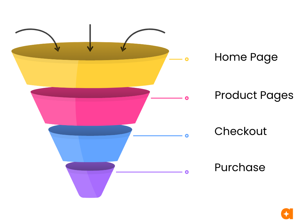
Understanding the Funnel
Before we dive into specific optimization tactics, let's talk about the sales funnel. Think of it as the path a visitor takes from first landing on your site to becoming a customer. Understanding this path is essential for boosting your conversion rate.
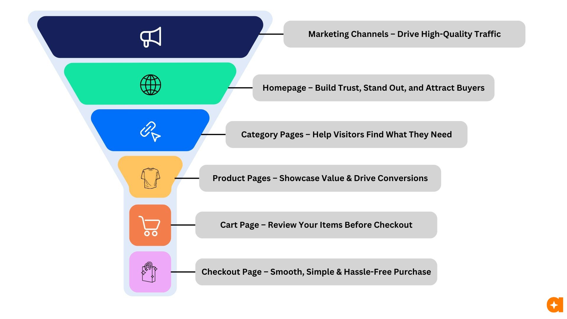
Here's the basic idea: every part of your website has a specific job. It's like a relay race, where each stage is designed to hand off the visitor to the next:
Ads: Their one and only job is to grab attention and get that click to your website.
Homepage: This is where you build trust, show off what makes you special, and entice visitors to check out your products.
Category Pages : These pages help visitors browse and find the specific product categories they're interested in.
Product Pages: These pages need to showcase the value of your products and convince visitors to add them to their cart. Think clear descriptions, great photos, and compelling reasons to buy.
Cart Page: This page allows customers to review their selected items and make adjustments before proceeding to checkout.
Checkout Page: This is the final hurdle! Your goal here is to make the checkout process super smooth and easy, so visitors complete their purchase without any hiccups.
It's important to remember that some drop-off is normal. Not everyone who clicks on your ad will browse your products, and not everyone who adds something to their cart will complete the purchase. That's just the way it is! But, by understanding each stage of the funnel, you can identify where you might be losing more potential customers than you should be, and fix those leaks. That's the heart of CRO – minimizing those drop-offs and getting more people to the finish line!
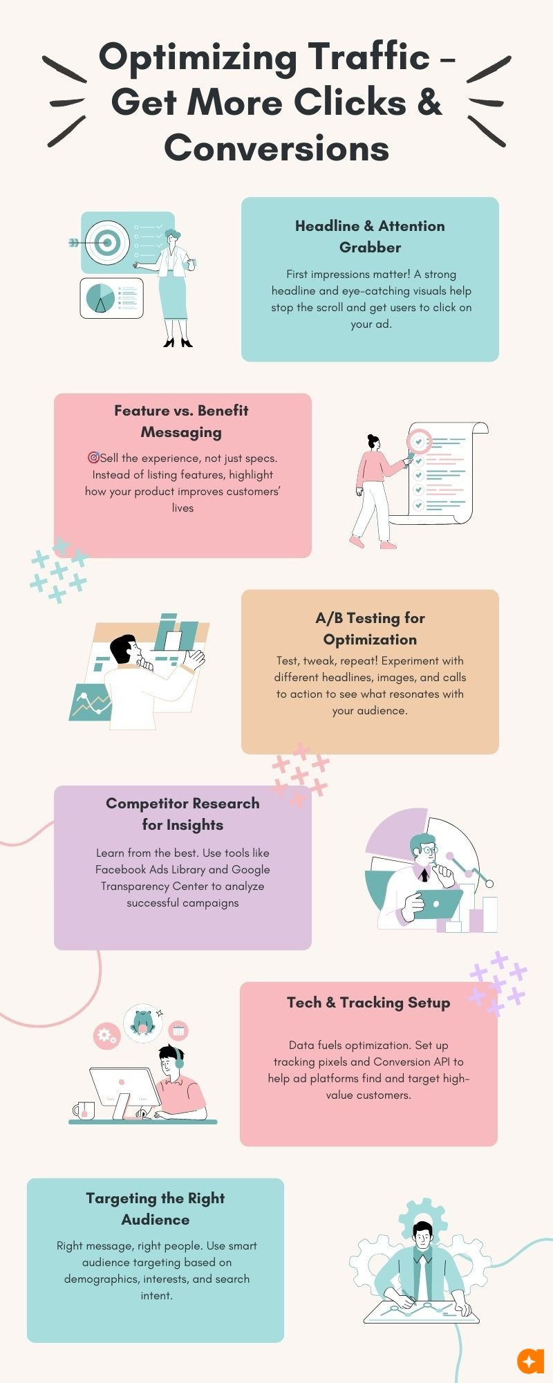
Optimizing Traffic – Get More Clicks & Conversions
Whether it's a Facebook ad, a Google search result, a social media post, a slick branding campaign, an email marketing campaign, referral traffic, or even your SEO efforts, their main job is to grab attention, spark interest, and get that click!
The best way to do that? Focus on how your product helps your customer. Instead of just listing features, tell them the benefits.
For example, don't say "This blender has a 2-horsepower motor." Say, "This blender crushes ice in seconds for perfect smoothies!" (Of course, the exact approach depends on what you're selling – think about your specific audience.)
In today's fast-paced digital world, your messages need to be eye-catching and different. Think strong visuals, clear messaging, and something that makes people stop scrolling. A key part of traffic source optimization is testing. Try out different images, headlines, and wording to see what resonates with your audience. A great shortcut? Peek at what your competitors are doing! You can use the Facebook Ads Library and Google's Transparency Center to see their current ads. Also look for successful campaigns by market leaders in different niches.
Source-to-Landing Page Consistency is Key. Make sure your landing page directly reflects the promise made in your traffic source. If a social media post promotes a 20% discount, that discount should be immediately visible on the landing page. Mismatched messaging creates confusion and leads to drop-offs.
Targeting the right audience is just as important as having a great message. Even the best content will flop if it's shown to the wrong people. Think carefully about keywords (what are people searching for?), interests (what else are your potential customers into?), and demographics. This applies to your organic SEO efforts as much as your paid campaigns.
And don't forget the tech! Modern ad platforms like Facebook and Google use smart algorithms to find your ideal customers. But they need data! Make sure you've got your tracking pixels and Conversions API set up correctly on your website. This tells the platforms who's actually buying, so they can find more people like them. For organic traffic, ensure your site is technically sound for search engine crawlers
Your Homepage: First Impressions Matter
Your homepage (or landing page) is like the front door of your online store – it's the first thing many visitors see. Making a great first impression is crucial, and it needs to happen fast!
Speed is King (and Queen!): If your site loads slowly, people will leave before they even see what you offer. Aim for under 3 seconds, and definitely no more than 5. Anything slowing you down should be optimized or removed. Every second lost is a potential customer lost. Use tools like Google PageSpeed Insights to identify areas for improvement.
Mobile-First Mentality: It's also crucial to remember that most of your visitors will be on mobile devices. Your homepage must be fully responsive and provide a seamless experience on all screen sizes. Test it thoroughly on different phones and tablets!
Next, you need to instantly communicate your value proposition. Think of this as your core message. It tells visitors:
What problem do you solve for them?
What benefits do you offer?
Why should they choose you instead of a competitor?
A strong value proposition is clear, specific, unique, customer-focused, and concise. Make sure your primary call to action (CTA) – what you want visitors to do – is immediately visible above the fold. This could be 'Shop Now,' 'Explore Our Collection,' 'Get a Free Quote,' or whatever is most relevant to your business.
For example, if you sell handcrafted leather journals, don't just say, 'We sell high-quality leather journals.' That's weak. A better option: 'Beautiful, handcrafted leather journals designed to inspire your writing and last a lifetime.' Even better: 'Capture your thoughts in a handcrafted leather journal, made with ethically sourced materials and backed by a lifetime guarantee. Find your perfect journal today.' See the difference? Avoid vague claims, focus on benefits and highlight what makes you different from the competition. If you serve distinct customer segments, consider how your homepage can quickly direct them to the most relevant information (e.g., separate sections for "Men's Wallets" and "Women's Handbags").
Your homepage also needs to grab attention visually but keep it clean! A compelling headline and strong visuals are key. A website promo can be effective, but don't let it overcrowd the page. White space is important for readability. And prominently display your unique selling propositions. Do you offer free shipping? A special discount? A satisfaction guarantee? Let visitors know immediately. Ensure your site's navigation is crystal clear and easy to use. Visitors should be able to find what they're looking for within a few clicks.
Finally, build trust and reinforce credibility. Online shopping can feel risky, so reassure visitors that you're a legitimate and reliable business.
Social Proof: Display customer testimonials, reviews (with star ratings), the number of customers served, or "as seen in" logos of publications.
Security Badges: Show security badges (e.g., SSL certificate logos) to reassure visitors about the safety of their transactions.
Clear Policies: Have clear and easily accessible shipping, return, and privacy policies. Link to these prominently in your footer.
Contact Information: Make it easy for visitors to contact you with questions or concerns.
Guarantees: Display any guarantees that you have.
Showcase your expertise. Include, if available, press mentions, or industry affiliations to build further credibility.
By focusing on these key elements and continuously testing through A/B testing to experiment with different approaches, you can turn your homepage into a powerful engine for driving conversions.
Category Pages: Guiding Users to What They Want
Category pages are like the aisles in a well-organized store – they help customers quickly find the type of product they're looking for. Think of them as mini-homepages for specific product groups. A well-optimized category page makes browsing easy and enjoyable, leading to more product views and, ultimately, more sales.
First, make sure your category names are clear and descriptive. Use language your customers would use avoid jargon or internal terms. Think about how people search and what terms they'd naturally use to find these products.
Just like your homepage, speed is crucial. Category pages often load many images, so optimization is key. Compress images and use lazy loading
Provide helpful filtering and sorting options. Let customers refine their search by price, size, color, brand, features, and any other relevant attributes. The more control they have, the easier it is to find exactly what they need. Make these filters easy to find and use don't hide them away!
Use high-quality images that showcase the products in each category. Consider using a consistent style or layout to create a visually appealing and cohesive experience.
Write short, descriptive introductions for each category. Briefly explain what the category contains and highlight any key features or benefits. This helps customers quickly understand if they're in the right place.
Product Pages: Sealing the Deal
The product page is where visitors make that crucial decision: to buy or not to buy. Your goal is to make that "Add to Cart" button as tempting as possible! Provide all the information a customer needs to feel confident in their purchase, right there on the page. You don't want them leaving to search for answers elsewhere. And definitely avoid any external links that could distract them.
Make it easy for returning customers to buy quickly with a fast checkout option. For everyone, provide clear ways to contact you if they have questions – a live chat option is fantastic, but prominent links to your customer support channels are essential.
Your product title should be clear, descriptive, and user-friendly – think about what customers would search for. Incorporate customer reviews and ratings near the title to build trust and social proof. If you have a sale, use the classic "strikethrough" pricing: show the original price crossed out next to the new, discounted price. Display prices in the customer's local currency whenever possible.
Image Optimization is Crucial:
High-Resolution Images: Use high-quality, zoomable images that showcase the product's details.
Multiple Angles: Show the product from multiple angles, giving customers a complete view.
Lifestyle Images: Include images of the product in use, helping customers visualize themselves using it.
Video: If possible, include a short video demonstrating the product's features and benefits.
Variant Images: For products with variations, use images that accurately represent each variant.
Alt Text: Use descriptive alt text for all images, for both SEO and accessibility.
Image Compression: Compress images to reduce file size without sacrificing quality. Tools like TinyPNG can help.
Detailed and Compelling Product Descriptions:
Focus on Benefits: Highlight how the product solves a problem or improves the customer's life.
Clear and Concise Language: Avoid jargon and technical terms that the average customer might not understand.
Scannable Format: Use bullet points, headings, and short paragraphs to make the description easy to read.
Key Features: List the product's key features and specifications.
Storytelling: If appropriate, use storytelling to connect with the customer on an emotional level.
Address Potential Concerns:
FAQs: Include a frequently asked questions (FAQ) section to address common customer concerns.
Shipping Information: Provide clear and concise shipping information, including costs and estimated delivery times.
Return Policy: Clearly state your return policy.
Size Charts (if applicable): For clothing or other size-dependent items, include accurate size charts.
Urgency and Scarcity:
Low Stock Indicators: If stock is limited, display a message like "Only 3 left!"
Limited-Time Offers: If you have a sale or promotion, highlight the deadline. Be genuine; avoid creating false scarcity.
And don't forget to highlight those extra perks! Free shipping? Easy returns? A special discount? A satisfaction guarantee? Make sure these benefits are clearly visible on the product page. Anything that makes the purchase more appealing should be front and center. These details can be the tipping point that turns a "maybe" into a "yes"!
The Cart Page: Nudging Towards Checkout
The cart page isn't just a holding area – it's a critical opportunity to encourage customers to complete their purchase! This is a great place to strategically increase your Average Order Value (AOV) and address potential drop-off.
Create a Sense of Urgency : If you have limited-time offers or low stock on certain items, highlight that information clearly. Phrases like "Only 3 left!" or "Sale ends in 2 hours!" can motivate customers to act quickly. Remember to be genuine; avoid creating false scarcity.
Free Shipping Threshold Motivation: If you offer free shipping above a certain order value, the cart page is the perfect place to remind customers visually. Show them how close they are to reaching that threshold with a progress bar or a clear message. For example: "Add just $10 more to your cart to qualify for free shipping!" This encourages them to add more items to their order. And if free shipping is already achieved, prominently highlight that benefit!
Relevant Product Recommendations: Another way to increase AOV is to offer relevant product recommendations on the cart page. Show items that complement what's already in their cart, or that other customers with similar purchases have bought. Phrases like "You Might Also Like..." or "Customers Also Bought..." can be effective. Consider using phrases like "Frequently Bought Together" or "Complete the Look."
Abandoned Cart Recovery is Essential: It's also important to acknowledge that cart abandonment is common. Many visitors add items to their cart but don't proceed to checkout. This is where abandoned cart recovery comes in. Make sure you have a system in place to follow up with these customers, reminding them of what they left behind and offering an incentive to complete their purchase. This can recover a significant amount of lost sales. Consider a multi-email sequence: a reminder shortly after abandonment, another 24 hours later, and perhaps a final email with a discount a few days later.
Reinforce Trust and Security: Consider showing trust signals, such as money-back guarantees, hassle-free returns, or secure checkout badges, to alleviate any lingering doubts and reassure customers about their purchase.
The Checkout Page: Closing the Sale
This is it – the final step! The checkout page is where visitors actually become customers. Your primary goal here is to make the process as smooth, simple, and distraction-free as possible. Remove anything that could pull them away from completing their purchase – absolutely no external links or unnecessary elements.
Guest Checkout is a Must: Always offer a guest checkout option. Forcing customers to create an account before they can buy is a major source of friction and can significantly hurt your conversion rate. Let them buy quickly and easily, and then offer the option to create an account after the purchase is complete.
Form Optimization for a Smooth Experience:
Minimize Fields: Only ask for essential information. Every extra field is a potential drop-off point.
Progress Indicator: Use a progress bar or steps indicator to show users how far along they are in the checkout process. This provides a sense of clarity and reduces anxiety.
Clear Error Messages: Provide clear, helpful, and inline error messages if users make a mistake. Don't just say "Invalid Input"; explain what went wrong and how to fix it.
Address Autocomplete: Use address autocomplete (powered by services like Google Places API) to speed up the process and reduce typing errors.
Inline Validation: Show errors in real-time as users fill out the form, rather than waiting until they click "Submit."
Mobile-Friendly Design: Ensure the checkout form is perfectly responsive and easy to use on all devices.
Upselling (with Caution): Many stores try to upsell on the checkout page to increase their Average Order Value (AOV). This can be effective, but be strategic. It's a balancing act: too much upselling can disrupt the checkout flow and hurt your conversion rate. If you do upsell, consider these approaches:
Post-Purchase Upselling: Instead of interrupting the checkout process, offer upsells after the order is confirmed. This is much less intrusive.
Order Confirmation Page Upselling: The order confirmation page (the "thank you" page) is another good place for non-intrusive upsells.
Subtle In-Checkout Upsells: If you do upsell within the checkout flow, make it extremely subtle and relevant to the purchase. For example, a small checkbox to add a related accessory that genuinely complements the purchase.
Offer a Variety of Payment Options: Provide as many payment options as possible. Include all major credit cards, popular digital wallets (like PayPal, Apple Pay, Google Pay), and, increasingly, "Buy Now, Pay Later" (BNPL) options (like Klarna, Afterpay, Affirm). The more choices you provide, the more likely customers are to find a method they're comfortable with. This reduces friction and increases the chances of a completed purchase.
A/B Testing: Your Scientific Path to Higher Conversions
A/B testing is like having a superpower for your website. It lets you test different versions of your website elements to see which one actually performs better, based on real user data. No more guessing!
Here's how it works: Based on your data analysis identify a specific element you believe is impacting conversions. Formulate a clear hypothesis. For example: "Making the 'Add to Cart' button bright red instead of blue will increase clicks because red creates a stronger sense of urgency." Then, create two versions of the page:
Version A (Control): The original version of the page.
Version B (Variation): The version with your change (in this case, the red button).
Use A/B testing software to randomly show Version A to some visitors and Version B to others. While Google Optimize was a popular free option, it has been sunset. Consider exploring other A/B testing tools like VWO, Optimizely, or AB Tasty, or utilize the A/B testing capabilities within Aixel for a streamlined workflow. Track the conversion rate for each version.
Statistical Significance is Key: Run your tests long enough to achieve statistical significance. This means there's a high probability that the results you're seeing are due to the changes you made, and not just random chance. Most A/B testing tools will help you determine when you've reached statistical significance. In simple terms, it means you have enough data to confidently say one version is truly better than the other.
Did the red button win? If the results are statistically significant and show a positive impact, make the winning version (Version B) the new standard on your site. And remember, A/B testing is a continuous process. There's always something you can improve.
What can you test? Almost anything!
Headlines: Value propositions, calls to action, tone of voice.
Calls to Action (CTAs): Button text, color, size, placement.
Product Descriptions: Writing styles, lengths, featured benefits.
Images & Videos: Product photos, lifestyle shots, explainer videos.
Page Layout: Arrangement of elements.
Offers: Discounts, promotions, bundles.
Forms: Length, required information.
Just remember to test one thing at a time. If you test too many changes at once, you won't know which specific change made the difference. And don't be afraid to embrace "failures"! Not every test will be a winner. But even "losing" tests teach you something valuable about your audience and help you refine your approach.
Ready to Optimize Your Conversions with AI?
Tired of guessing and ready to start seeing real, measurable results? Aixel is building the future of conversion rate optimization, one intelligent insight at a time. Aixel helps you stay on top of your store performance and provides you with AI-driven insights to pinpoint exactly where you're losing customers and what to do about it.
Join the waitlist at Aixel.io today and be among the first to experience the power of AI for your eCommerce conversion optimization.